Air Academy High School’s Website Is a Mess–But It Won’t Be Forever
Air Academy High School has many virtues: a variety of clubs, many class options, well-informed office staff and educated teachers.
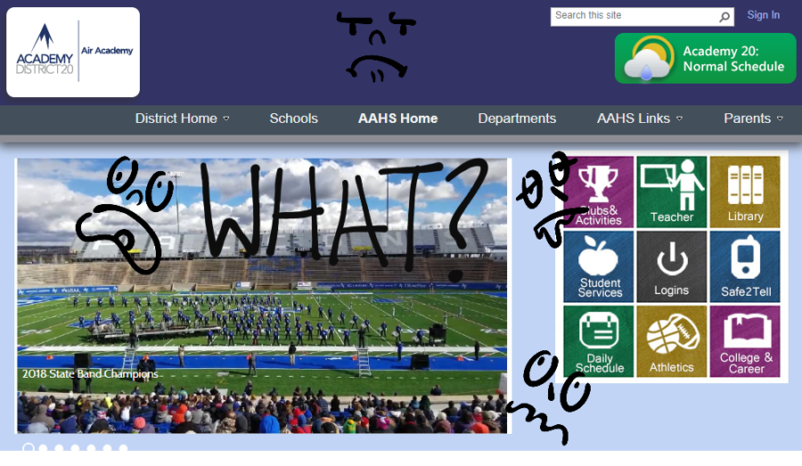
Unfortunately, its website is a bit of a mess.
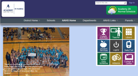
Then, there’s a colorful and engaging square with links to several parts of the AAHS website: clubs, teachers, the library, student services, logins, Safe2Tell, the daily schedule, athletics and college and career information.
“[Because] the district…wanted a more unified look across the schools, they pushed out web design software to every [school]…the overall look of [the website] is pretty set by the district at this point so we fill in the blanks,” said english teacher and digital learning coach (DLC) Heather Scott who, as DLC, works closely with teachers as they navigate Schoology.
Scrolling down, there’s a sidebar with links to several different pages, including administration (with office staff titles, phone numbers, and email addresses), theater (with times, dates and prices for “Joseph and the Amazing Technicolor Dreamshow”–and no other information) and the testing schedule (which will take place on April 9th-12th). Some of these pages are too wordy, while others are all but entirely blank.
“A lot of times, what is sent to me to put on from the different departments and activities is what I update, or a lot of the time I’ll look at the calendar and that’s why I put on the website…[But] lot of different people help update it,” said librarian and Air Academy website manager Katy Sebben.
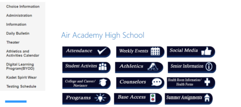
Next to this sidebar is a maze of buttons.
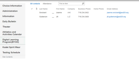
The left-topmost link is for attendance. Clicking on this brings you to:
A blank page, with secretaries Joanne Swickard’s and Jill Guiberson’s contact information.
What does this mean?
To a seasoned AAHS student, this is obvious: you have to have a parent email or call one of the hardworking secretaries to have your absence from school excused.
However, this page is often bewildering for newly-arrived Kadets. Already disconcerted by the maze of web pages they had to navigate to get here (not to mention the school itself), students and their parents will stumble upon this page and have no idea what to do.
“When I was a new student I was concerned [because] there were certain things that weren’t under the tab that you’d expect them to be under,” said junior Ellie Kuhn.
Sebben noted, “For new students, it’s probably not as friendly for students who have been here awhile.”
Adding a few simple navigation instructions could fix this problem in moments.
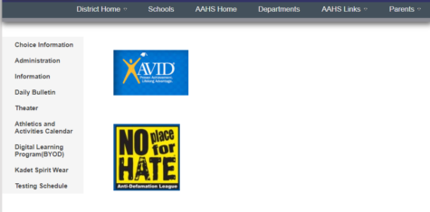
Another button in this configuration leads you to the programs page. Surely this should have links to information about Career Start, National Honor Society, DECA, Student Council, and other programs essential to Air Academy student life.
However, it does not.
AVID and No Place for Hate (which is not a program at AAHS anymore) are the only items listed on this page.
What about the others? What will new students think when instead of being amazed and excited about the variety and choice students have at AAHS, they are confused and disappointed at the lack of variety our school website exhibits?
“[The website] is definitely hard to navigate especially when you’re looking for certain information,” said Scott. “Some of the general school information can sometimes be difficult; sometimes they’ll have a schedule for an upcoming event…buried down the page or there’s a link and it’s written in text that’s a little bit small and hard to find.”
Perhaps an update is necessary.
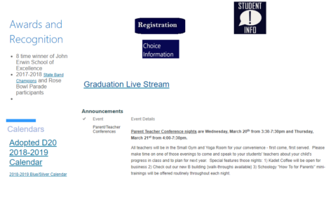
Beneath these buttons is general information: student info, registration, etc:
While there’s nothing specifically wrong with this section (other than some outdated parts of Choice Information leading all the way back to when Air Academy’s B Building was under construction, as well as some other flaws in the calendars and scheduling), the website has flaws.
“It’s ugly. It needs to be more aesthetically pleasing,” said Kuhn.
And if you thought the website was painful to look at on a laptop, you’ll be horrified at the mobile version:
However, the website does have a good reason for its setup. District 20’s website is in compliance with the ADA (Americans with Disabilites Act), which helps students who are blind, for example, use built-in audio software to read aloud the school page’s information.
Essentially, while many creative, graphic-focused school websites may be more interesting to look at, oftentimes, “[They’re] not friendly for…users [with disabilities]. The district is trying to have a balance of both,” said Scott.
Next year, though, there’s hope for the Air Academy website.
“There is going to be a new look and feel to the website next year, because we’re getting new…software to design the website,” said Sebben.
With updates coming, students and teachers alike are optimistic for a new and improved website.
“For a lot of us the hope is that it will be simpler to use for everybody and that it will be more intuitive,” Scott finished.


